PrettyShot guide
How to add padding and rounded corners to a screenshot
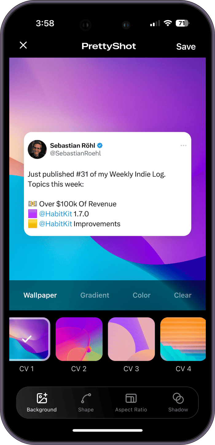
Import the screenshot into PrettyShot, open the Shape controls, add padding to expose the canvas, then adjust Rounded and Inset until the capture has a clear edge. Finish with a restrained shadow if the background needs more separation.
The short version
- 01
Set a background
Choose a canvas color, gradient, or wallpaper that contrasts with the capture.
- 02
Add padding
Increase the space until every edge is easy to see at feed size.
- 03
Round the corners
Use a radius that fits the size and content of the screenshot.
- 04
Check inset and shadow
Add depth only when it improves separation from the canvas.
Padding is part of the composition
Padding is the space between a screenshot and its final canvas. It prevents the capture from running into the image edge and gives the background a visible role. The right amount depends on the density of the content, the export ratio, and the size at which someone will view the result.
Begin with equal space on every side. Look at the screenshot as a shape rather than reading it. If it appears low or top-heavy, adjust the crop before using extreme padding values to compensate. A balanced crop makes every later choice easier.
Choose padding by viewing size, not by a fixed number
A square social card can support wider margins than a screenshot placed inside a presentation. A long conversation capture may need minimal side padding so the type remains readable. Always preview the full image at roughly the size it will occupy in the feed, message, or document.
If your eye notices the empty space before the content, the padding may be too large. If you cannot find the screenshot edge, it may be too small or too close in color to the background. PrettyShot keeps the canvas and content visible while you adjust the shape, making those tradeoffs easy to compare.
Rounded corners should match the screenshot scale
Corner radius changes how the capture feels. A small radius reads as precise and editorial. A larger radius can echo a phone screen or social card. Avoid rounding so far that controls, avatars, or text near the corner are clipped or look compressed against the curve.
Use the same radius across a carousel or series. Consistency matters more than finding a perfect value for every frame. When screenshots have different dimensions, judge the visual curve rather than assuming one setting will look identical on each image.
Use inset when one boundary is not enough
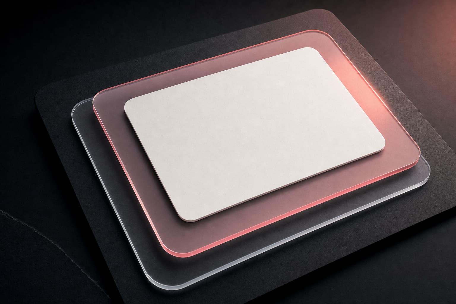
Inset creates an additional translucent layer around the screenshot. It can help when the capture and background have similar tones, or when you want a glass-like frame without changing the wallpaper. Keep the effect quiet so it supports the content instead of turning the screenshot into a decorative object.
A strong inset plus a heavy shadow usually adds too many edges. Try each control separately, then combine them at lower levels if needed. On a detailed wallpaper, inset can provide a calmer zone around the screenshot and protect text clarity.
Add a shadow only after the spacing is right
Shadow cannot replace contrast or padding. Set the canvas and shape first, then raise the shadow until the edge separates. A soft shadow is useful on gradients and wallpapers, while a high-contrast solid canvas may need little or none.
Inspect the final export for clipping at the canvas boundary. If the shadow ends abruptly, reduce its strength or add more padding. The finished image should still read clearly when compressed by a social app or viewed on a small screen.
Questions about this workflow
Do rounded corners crop screenshot content?
They can affect content placed very close to the corners. Use a modest radius or crop with extra space around important controls and text.
Should every screenshot use the same padding?
A series should feel consistent, but tall and wide captures may need small optical adjustments. Match the visible spacing rather than relying only on one setting.